To give your app listing the best possible start, you’ll want to dedicate the most time to the following nine elements:
- App title.
- App category.
- App descriptions.
- App icon.
- Feature graphic.
- Screenshots.
- Promo video.
- App rating and reviews.
- Google Play Android Vitals.
We’ll take a closer look at optimizing each of these elements, but always refer to official Google guidelines while managing app listings for Google Play.
App Title
Optimizing your app title for Google Play will feel familiar if you’re used to optimizing website titles for search.
You want to start with the product/branded name of your app and then include a brief description – in no more than a few words – using your primary keyword.
You can use up to 30 characters in your app title, but try to keep it as short and punchy as possible.
Prioritize accuracy over keyword targeting and highlight the key benefits of using your app.
App Category
Selecting the right category for your app is essential for matching with relevant searches.
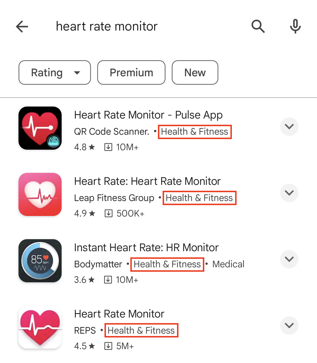
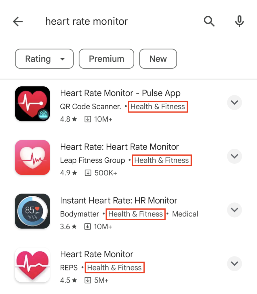
For example, let’s say you’re promoting a heart rate monitoring app. In this case, “Health and Fitness” is the most appropriate category.
Screenshot from Google Play, February 2024
When users specifically search for “heart rate monitor,” the keywords in your title are a stronger signal.
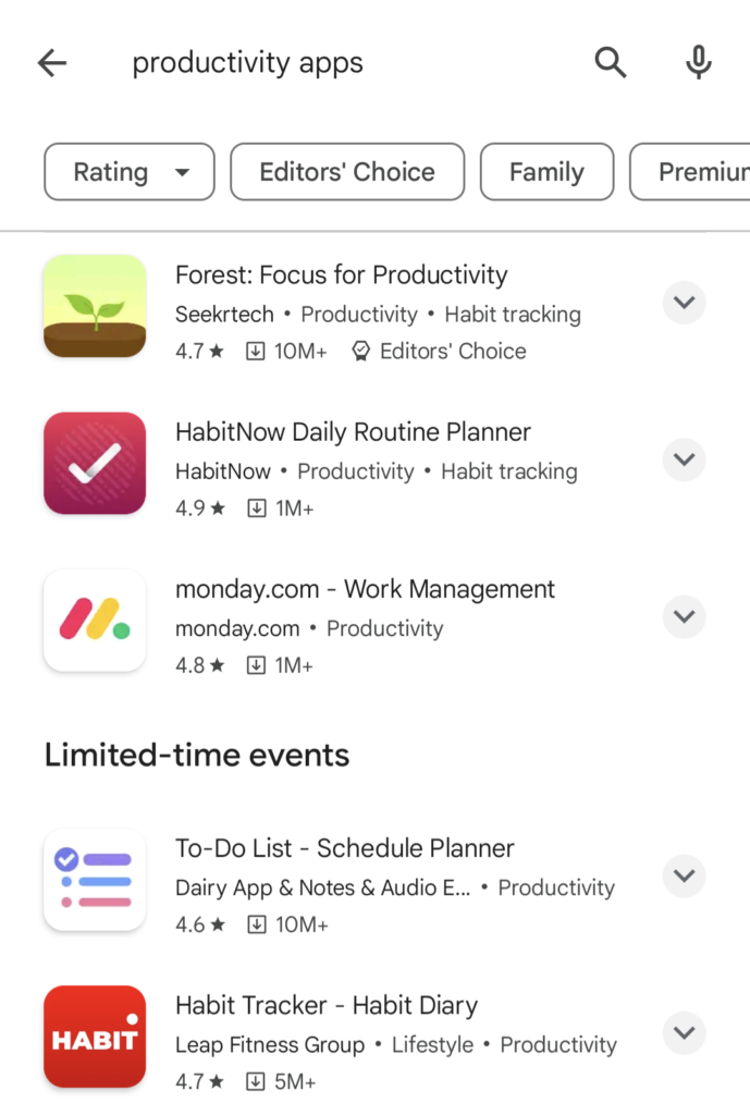
However, your app category can help your app show for more general searches like “health and fitness apps” or “productivity apps.”
Crucially, users can also browse categories in the Google Play store to discover new apps without searching.
For more info on selecting the right app category for Google Play, take a look at this Play Console Help page.
Short & Long Descriptions
In Google Play, your app listing includes two descriptions: A short description that shows under the About this app preview and a full description that users can reveal by clicking on the arrow highlighted below.
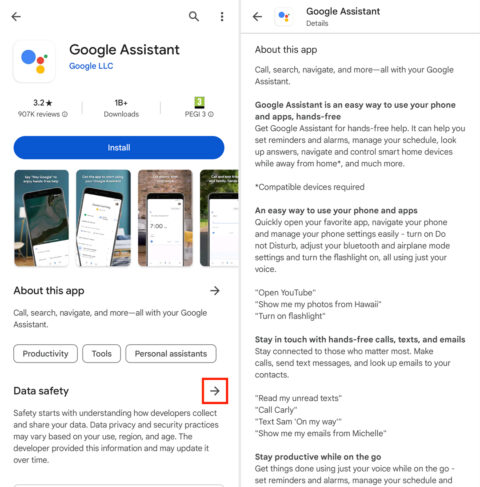
You can use up to 80 characters for your short description and 4,000 characters for your full description.
In your short description, try to describe the core functionality of your app in the most compelling way possible.
Accuracy is key here, but you want to convince users to install your app – so highlight the most attractive benefits.
Your full description provides a more in-depth summary of what your app offers.
Remember that most people won’t click through to read the full description, and those who do are looking for information, not a sales pitch.
You’ll find Google’s official guidelines for creating app descriptions under the “App descriptions” section of this Play Console Help page.
App Icon
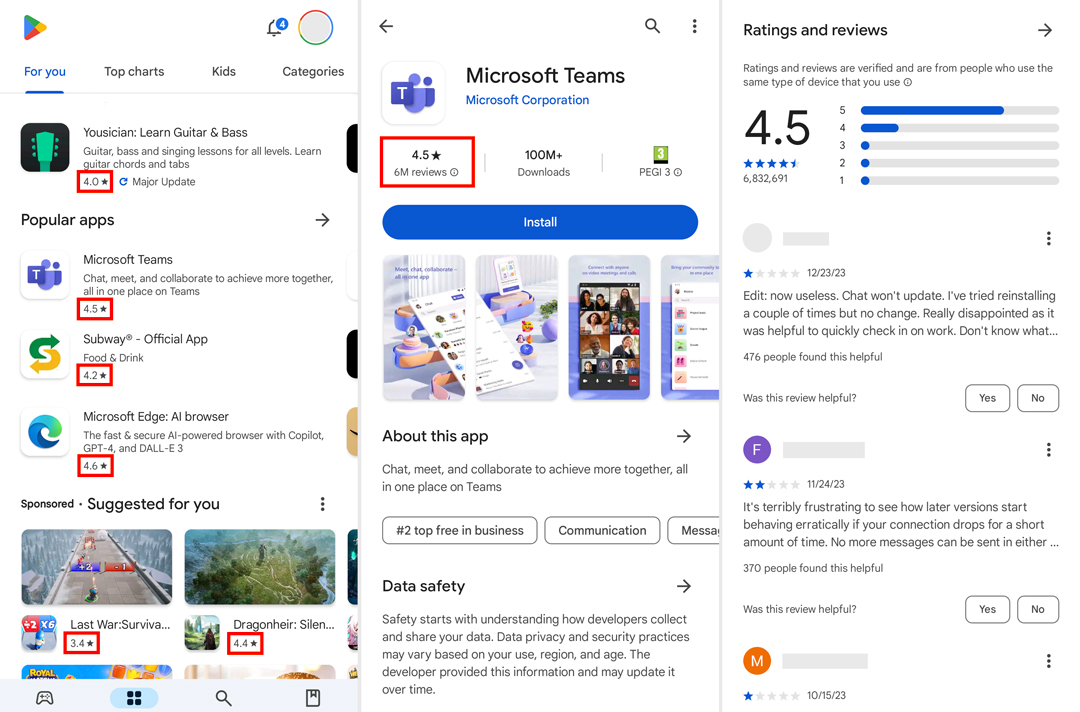
App icons show on the left side of search listings in Google Play and the top-right of app listing pages.
These are the most prominent elements on app store results pages.
Ideally, you want an app icon that either visually describes the role of your app or leverages your brand image as a differentiator.
Designing a unique icon is more challenging if your app has a specific purpose and many competitors – e.g., a heart monitoring app.
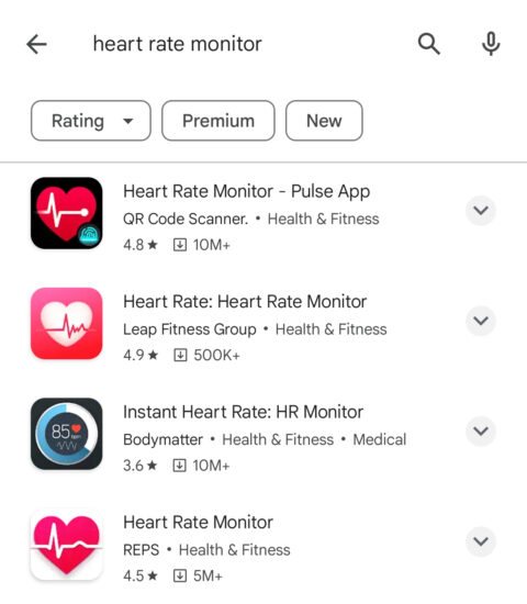
If this applies to your app, use design principles like contrast to make your listing stand out from other results.
Notice how Pulse App’s Heart Rate Monitor app stands out from the other listings above?
This is thanks to a combination of simple iconography with strong contrast, using a black background to stand out from the white Google Play results page.
Compare this to the REPS app, which uses similar iconography without a black background, and the Bodymatter app, which uses a black background but a more complex design.
Google Codelabs has an excellent tutorial on designing and previewing app icons. It includes best practices and tips for making an icon that stands out on results pages and the latest Android features, such as adaptive icons.
Feature Graphic And Promo Video
Feature graphics show on your app listing page and can also show for branded searches, paid ads, or recommendation sections on Google Play.
Until recently, you could only use images as featured graphics, but you can now use promo videos in their place.
This is one of the most visible assets on your Google Play listing, so use feature graphics to capture attention and showcase the best of your app.
Google suggests:
“Use graphics that convey app or game experiences, and highlight the core value proposition, relevant context, or story-telling elements if needed.”
You’ll find more guidance on creating feature graphics under the Preview assets section of this Play Console Help page.
App Screenshots
App screenshots show in the same horizontal panel as feature graphics on your app listing page.
They’re designed to showcase the best features of your apps while showing users what the in-app experience looks like.

You can include descriptive text in your screenshots to emphasize the key benefits of your app’s most important features.
Keep things descriptive, though.
Google prohibits the inclusion of performative or ranking text in screenshots, such as “app of the year” or “most popular…” and promotional information like “10% off” or “free account.”
If your app supports multiple languages, you’ll need to provide screenshots for each language version, including any translated descriptive text.
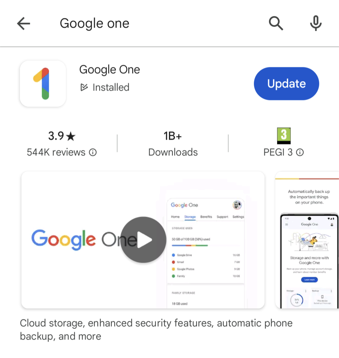
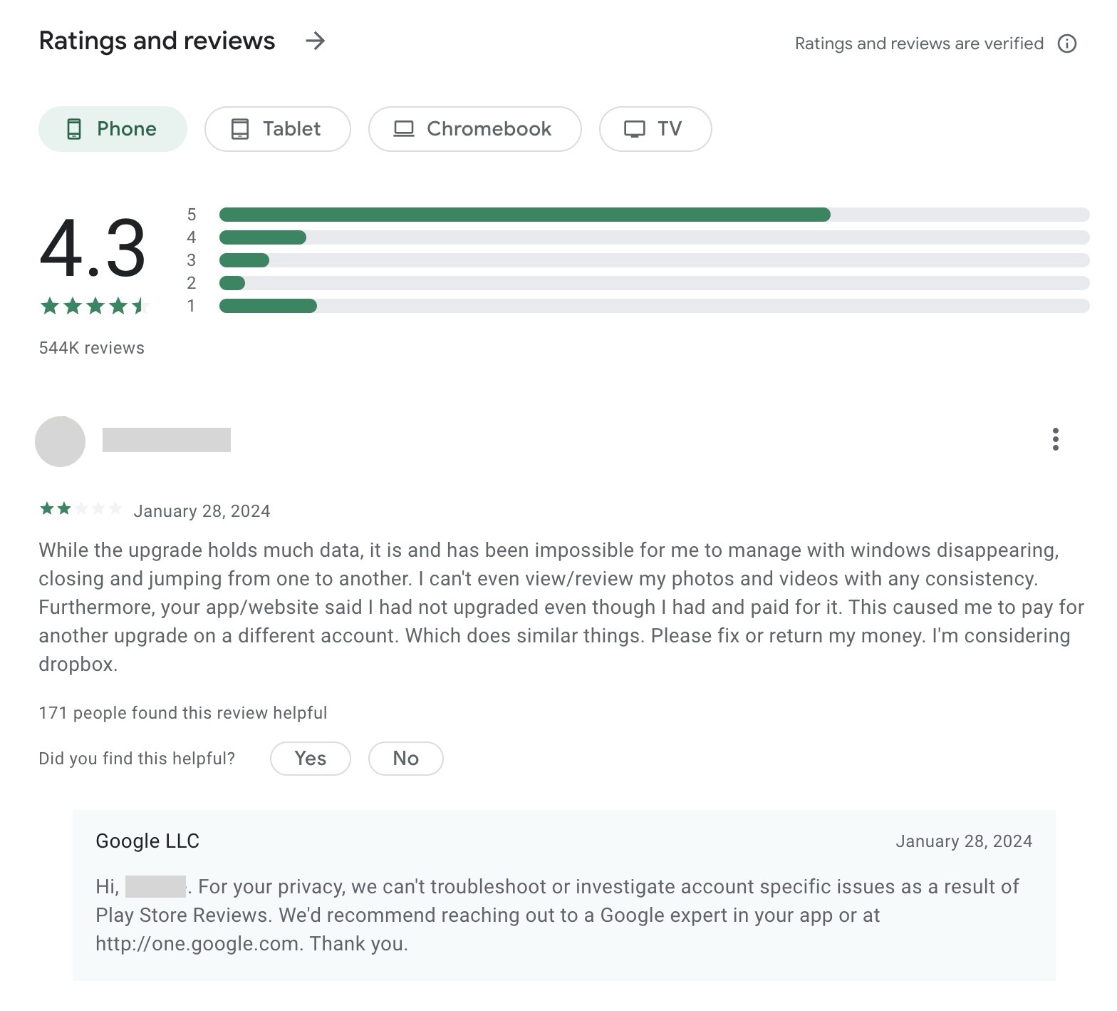
App Ratings & Reviews
App ratings show prominently in results and at the top of the app listing pages in Google Play. Besides this, you’ve also got a prominent Ratings and reviews section as the largest element on your listing page.

Aside from being a ranking factor, app ratings and reviews are one of the biggest trust factors that help users choose which apps to install.
You don’t need perfect review scores but a positive (3.5+ stars) is a great asset for rankings and installs.
Your review profile also allows users to view the feedback left by others – and how you respond. Once again, how you deal with user problems is often more important than the scores or feedback itself.
You’ll need a framework in place for generating regular reviews and replying to them, engaging with reviewers, and solving user issues.
Your replies are also visible, so avoid generic responses – show new, potential users how good you are at dealing with problems.
In fact, don’t take inspiration from Google’s own support team for Google One. Privacy is great, but the tone of the reply below is more dismissive than helpful, and the exact same response appears throughout replies.
This feedback can also help you develop a stronger product, and users often edit their reviews, following updates or resolved tickets.
Always remember: Long-term revenue is the goal, which starts with quality app experiences, engagement, and retention.
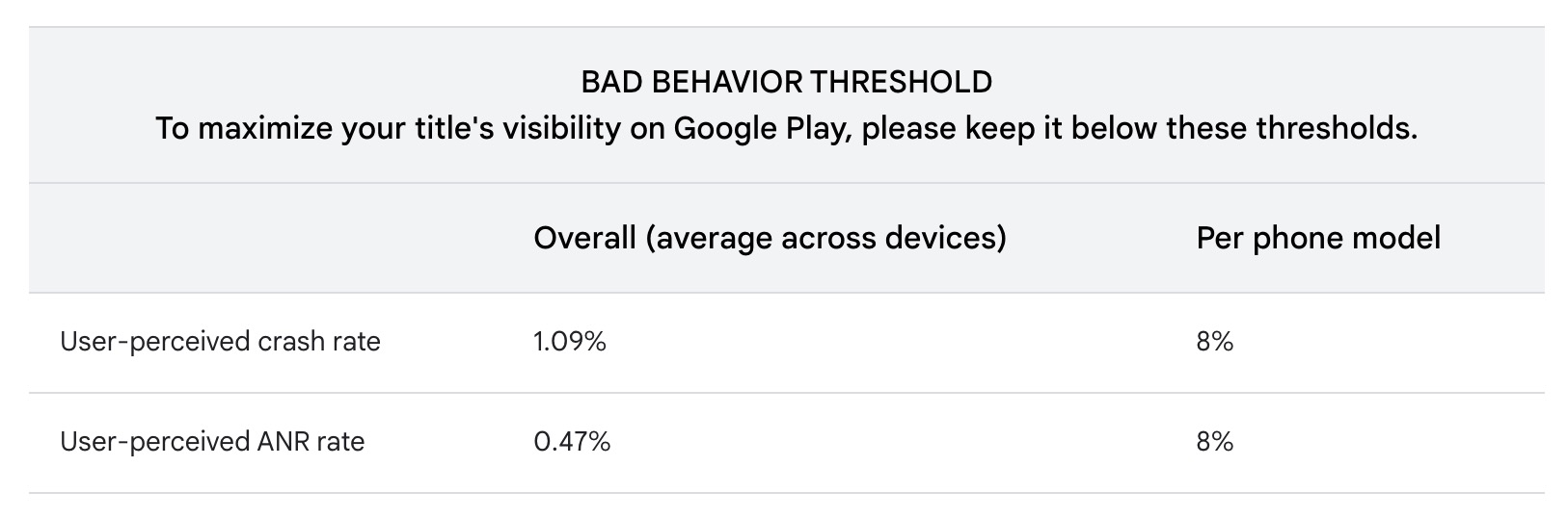
Google Play Android Vitals
Google provides an extensive toolkit for optimizing your mobile app. Its Android vitals initiative sets out the most important usability metrics that affect the visibility of your app on Google Play.
If you’re used to optimizing websites for search, this will sound a lot like Google’s Core Web Vitals.
The principle Android vitals is similar in terms of performance affecting your search ranking, but this is a far more extensive initiative than Core Web Vitals, as it stands.
Android vitals are broken into two key components:
Core vitals
- User-perceived ANR rate
- User-perceived crash rate
All other vitals
- Excessive wakeups
- Stuck partial wake locks
- Excessive background Wi-Fi scans
- Excessive background network usage
- App startup time
- Slow rendering
- Permission denials
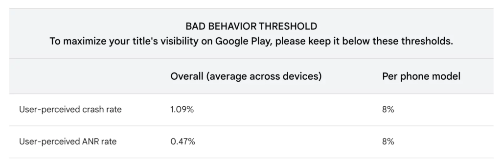
To maximize the visibility of your app in Google Play, keep the user-perceived crash rate below 1.09% across all devices and 8% per device, with the user-perceived ANR rate below 0.47% across all devices and 8% per device.
Take a look at the official Android vitals documentation page for more information.
Leave a Reply